Original images held by the Harvard-Yenching Library of the Harvard College Library, Harvard University
Summary written by Juhee Kang (Ph.D., Department of East Asian Languages and Civilizations, Harvard University)
The Harvard-Yenching Library’s collection of South Korean movie posters presents an extraordinary visual narrative, offering scholars a unique opportunity to examine the aesthetic, cultural, material, and historical transformations experienced by the South Korean film industry from the latter half of the twentieth century onward. The collection comprises over 160 posters from movies produced between the 1970s and the 2010s. Many of these posters, due to their large sizes, defy easy digitization, having been directly collected from theater windows and production company archives. Yet, if anything, their physical characters, such as wrinkles and marginal notes, enhance their charm and give them a tangible sense of historicity.
Movie posters had humble beginnings. According to American film and media scholar Ash Kinney D’ Harcourt, even in their earliest forms, these posters served as a bridge between the audience and the cinematic experience. Their primary role in film publicity was to distill a movie’s essence into persuasive visual elements – its storyline, climax moments, stars, production quality, and drama – to entice passersby from the street and into the theater. When commercial films became accessible to general audiences unfamiliar with watching moving pictures in theaters, posters even portrayed the act of viewing a film itself, featuring images of projectors and operators to demystify this novel technology of entertainment.
As competition between studios intensified and globalized throughout the twentieth century, strategic advertising campaigns gave rise to increasingly eye-catching and evocative poster art. Traditional hand-painted posters gradually gave way to digital designs, mirroring technological advancements and a growing intentionality behind their creation. Poster design turned from mere tools of familiarization into artistic representations that not only conveyed a film’s message and mood but, in some cases, functioned as an integral extension of the cinematic experience itself. Through a degree of abstraction and the strategic use of symbols and signs designed to elicit curiosity, responses, and associations, film studios further employed posters to captivate and engage new audiences. Even a broad overview of the Yenching collection reveals how, over time, modern Korean film posters sought to create and preserve distinctly Korean elements while embracing more secular and global trends.
Now globally acclaimed, the South Korean film industry has undergone many breakthroughs. From the 1960s to the 1980s, the industry was heavily regulated by the government, resulting in a focus on anti-communist and state-approved themes. One of the earliest in the collection, a 1974 poster for I Won’t Cry, directed by Cannes-winning Im Kwon Taek, exemplifies this focus (figure 1). The central figure – a young boy with an intense expression, gripping a machine gun – stands tall against a bold red background. Beneath him are smaller characters, from a resolute-faced elder to mothers hugging their children, set against a backdrop of tanks and somber war scenes. This composition elicits a deeply emotional response from audiences, many of whom had lived through or heard about the hardships of the Korean war. In the top left corner, bold yellow text contrasts sharply with the red background, visually accentuating the message: “A masterpiece encapsulating anti-Communist ideology!” On the right side of the poster, a call number for reporting espionage activities is displayed within a white box alongside a phone icon, emphasizing how the private art of film overlaps with public safety initiatives in the 1970s. From the poster, we can grasp that the movie itself functions as a state-approved propaganda tool. The powerful emotions evoked by the poster preordain the ideal response of the viewer: that despite the hardships depicted, one must remain vigilant against the atrocities of communism and resist its influence.
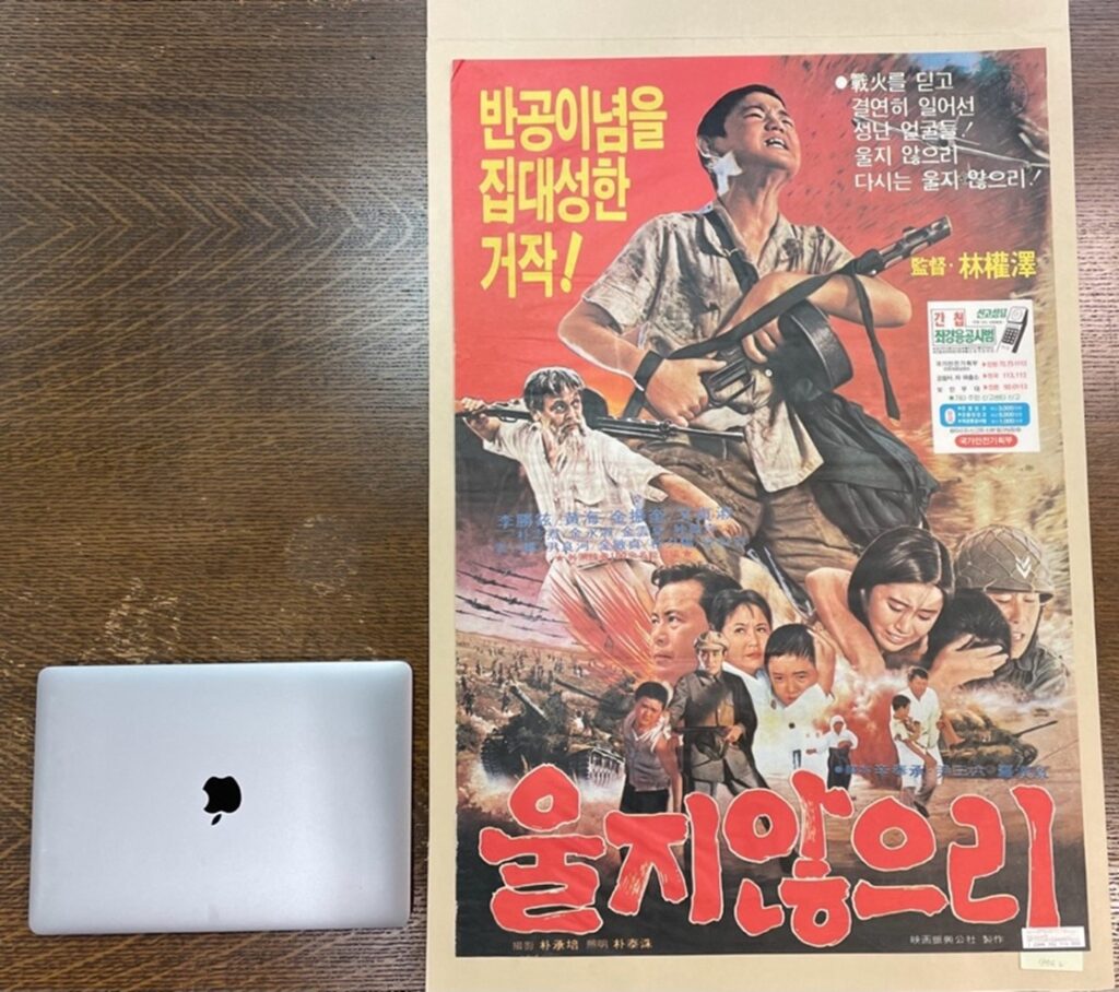
Figure 1. I Won’t Cry by Im Kwon Taek (1974). On the poster, from the top left, “A masterpiece encapsulating anti-Communist ideology,” to the right, “Infuriated faces transcending the fires of war! Won’t ever cry again! Won’t!” On the bottom, the title, “I Won’t Cry.” Apple 13 inch-laptop for size comparison.
The bulk of Yenching Collection, however, consists of posters from films produced after the 1990s – a period that marked a watershed moment in South Korean cinema with the relaxation of censorship laws and the rise of a new generation of filmmakers. This era, often heralded as the “Korean New Wave,” saw a surge in creativity, genre diversity, and a commercial boom that led to international recognition. Movie posters unmistakably reflected these changes. Notably, in contrast to earlier posters like I Won’t Cry (1974, figure 1), where the only clearly recognizable name was that of director Im Kwon-taek, these 1990s posters prominently display the names of the main actors and production staff. This shift highlights how the marketing strategies of the film industry evolved, emphasizing star power and production teams for immediate recognition by poster viewers.
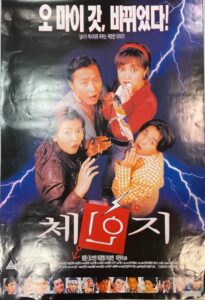
Movies during this period became much more secular, diverse, and adventurous in their stylistic approaches and storylines, with posters readily capturing these innovations. For example, Change (1997, figure 2) and The Soul Guardians (Toemarok, 1998, figure 3), released just a few months apart, both contain the end-of-the-millennium aesthetics of futurism and cyber-punk, featuring four main characters. However, the films differ sharply in every other aspect.
Change tells a comedic story about a teenage boy and girl who switch bodies and experience the awkward, often humorous bodily reactions that occur during puberty – a once-considered taboo and profane topic for entertainment (brining to mind the American classic The Hot Chick (2002) directed by Tom Brady). In the poster, the main characters, dressed in everyday, unremarkable clothing with no elements of dignity or grandeur, display expressions ranging from startled to apprehensive and shocked. They gaze directly at the viewer, a visual technique designed to invite immediate, hypothetical engagement. The characters create a sense of relatability, drawing the viewer into the narrative and sparking curiosity about their expressions (i.e., “Why do they look like that?”). Separately, the poster’s taglines suggest the viewer’s familiarity with English phrases like “Oh my god” and “sexy,” written in Korean phonetic transcription. This reflects the increasing foreign, particularly Anglophone, influences not only in Korean cinema but also within South Korean society, signaling a favorable attitude toward global, especially Western, trends.

Figure 2. Change by Lee Jin Suk (1997). From the top to bottom, “Oh My God, [it is] Changed!” “A thrilling story of a man and woman turning sexy (an allusion to ‘body swap/sex change’),” and on the bottom, “Change,” followed by a list of names of main actors, director, and production staff.
By the late 1990s, the genre – fantasy thriller – had gained enough market power to warrant the poster’s claim of a “Korean-style blockbuster.” This reflects the moment in cinema history when South Korean films began to vie for attention against Hollywood and Japanese imports that had dominated the domestic box office. Genre-defining films such as Total Recall (1990), Terminator 2 (1991), The Fifth Element (1997), and The Ring (1998) were huge global hits, prompting Korean filmmakers to explore similar themes and styles as efforts to capture audiences and position their films in the international market. These early attempts show how South Korean cinema tried to evolve, blending local storytelling with global trends to broaden its competitive appeal.
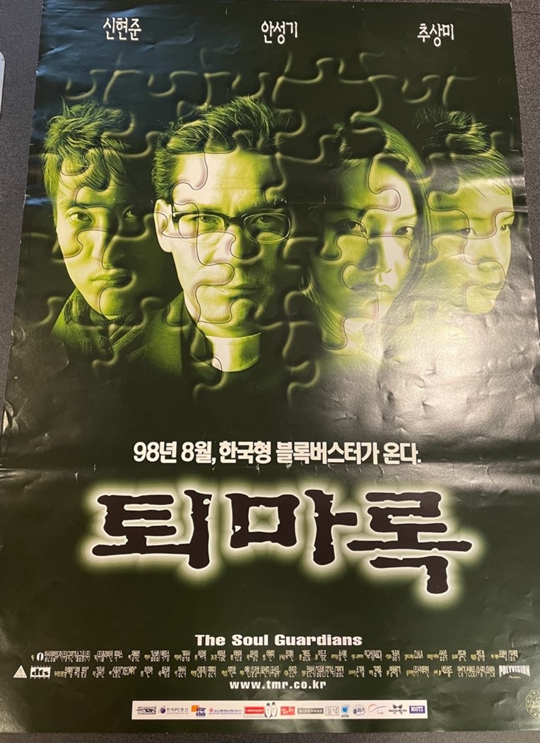
Figure 3. The Soul Guardians by Park Kwang Chun (1998). From the top: names of three main actors, in the middle, “August [1998], coming forth the Korean-style blockbuster,” “Toemarok,” and at the bottom, below “The Soul Guardians,” a list of production details and staff names.
Beyond providing a more engaging entertainment experience, this resurgence was fueled by increased investment from Korean conglomerates and supportive government policies that promoted the local film industry and artistic expression. These combined efforts contributed to the thriving cinematic landscape and are reflected in the evolving visual styles of the movie posters from this period. The posters in the Yenching collection clearly attest to these shifts. On many of them, the names of the Ministry of Culture and Tourism, various municipal entities, and major entertainment and production companies appear at the bottom in smaller fonts, often followed by the names of the director and starring actors. This layout reflects the increased collaboration between the private and public sectors in bolstering the success of the Korean film industry.
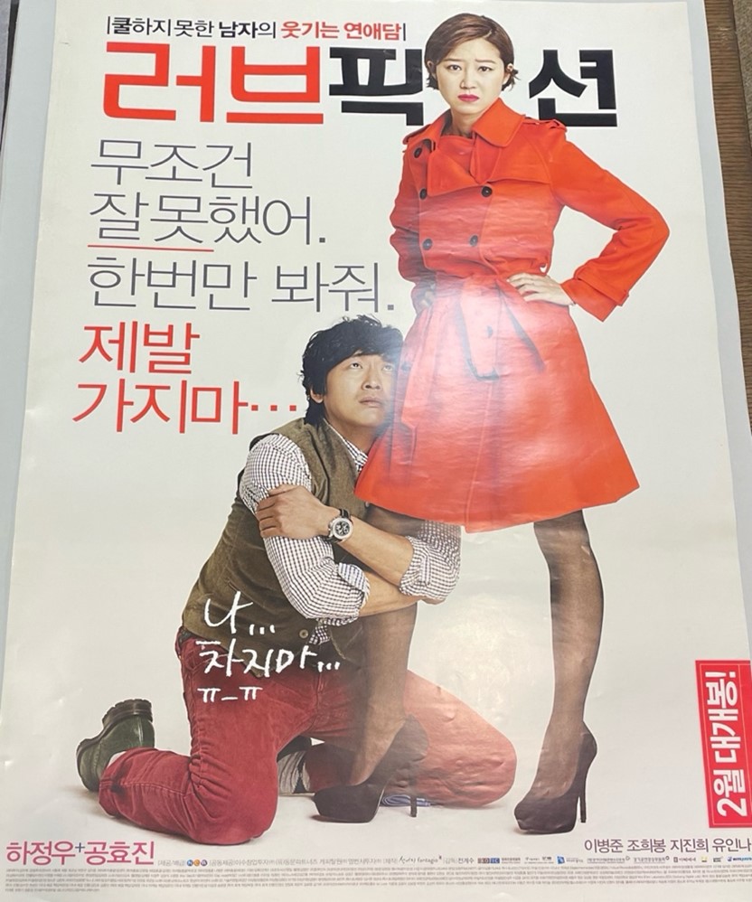
Figure 4. Love Fiction by Jeon Gye Soo (2012). From the top, “A hilarious romance story of a man who is not cool – Love Fiction,” in the middle, “I am absolutely at fault. Please forgive just once. Please don’t leave me,” and within the body of the man, “Me… Please don’t dump me… (crying emoji).”
The posters from the early 2010s reveal yet another evolution in both storyline and character development, particularly regarding female leads, while also demonstrating how posters became a more active extension of the movie-watching experience. Viewers would now often revisit posters to uncover hidden meanings or gain additional insight into the film. In subtle yet significant ways, storylines and characters became more nuanced, especially with women playing increasingly dominant roles – not only in name but also in terms of agency, even when cast in traditionally conventional parts. This shift is palpable in the poster art itself.
In Love Fiction (2012) by Jeon Gye-soo (figure 4), the poster vividly captures the dynamic between the characters. It depicts a man on his knees, clinging desperately to the leg of the female lead, accompanied by the caption, “I am absolutely at fault, please forgive me this once. Please don’t leave me.” The woman, dressed in a striking red trench coat and high heels, stands tall and confident, looking directly at the viewer. She is the one engaging with the audience, almost as if inviting them to weigh in on the man’s pitiful display, suggesting a clear shift in power. This visual encapsulates the gender dynamics in the film, with the woman asserting control while the man grovels for forgiveness. The poster’s clean and playful design clearly targets a female audience, reflecting the growing consumer power of young adult women from the 2000s. This demographic, which had gained significant purchasing influence, extended beyond the traditional housewives who typically managed household finances but had a limited disposable expense.
The poster itself hides cheeky elements legible only for those who watched the movie. For one, the film’s title, Love Fiction, plays on its central theme, as the plot revolves around the male novelist crafting a romantic fantasy. Then, the somewhat exaggerated captions, reiterating the man’s pleas for forgiveness and his desperation to preserve the relationship, serve their surface purpose on the poster but gain a whole new layer of meaning after watching the film. The captions transform into an insider joke, offering a clever nod to the film’s deeper themes. In this way, the poster functions as more than just an advertisement. It becomes an integral part of the narrative experience, enhancing the viewer’s connection to the story both before and after watching the film.
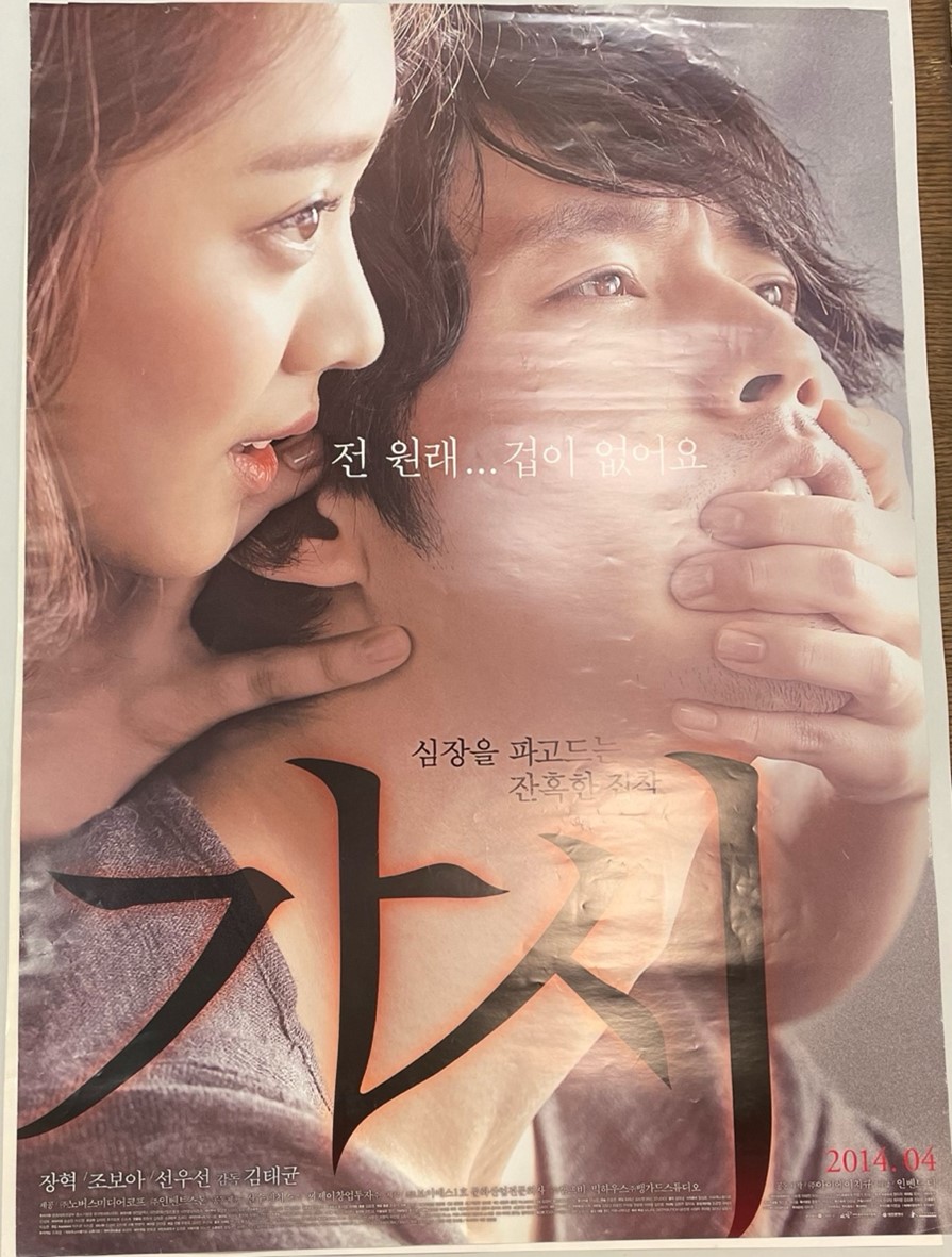
Figure 5. Innocent Thing (“Gashi [Thorn]”) by Kim Tae Kyun (2014). A woman whispering, “I am naturally fearless,” and right above the title, “A cruel obsession that penetrates the heart.”
However, a closer look reveals unsettling details. The caption, with the woman whispering, “I am naturally fearless,” taunts the viewer with an assertion of female agency – a phrase typically used in benign contexts but here imbued with a sense of menace. Paired with the tagline above the title, “a cruel obsession that penetrates the heart,” this begins to shift the viewer’s expectations. As one examines the poster further, the subtle fear on the man’s face becomes more apparent, and the woman’s hand, half-blocking his mouth, hints at control rather than affection. This visual tension between a seemingly tender embrace and underlying danger draws the viewer in, hinting at something far darker beneath the surface.
The movie narrates the tale of a schoolteacher who, behind his pregnant wife, becomes embroiled in an illicit affair with his student. As the student tenaciously refuses to end the affair, the teacher finds himself increasingly entangled in a web of deceit and peril. The film’s poster, layered with both fear and allure, serves as a prelude to its psychological thriller. It also subtly subverts the patriarchal trope of the “bad wolf tempting an innocent girl and rendering her a fallen woman,” by stripping the unfaithful man of his impunity. The poster suggests that it is the young girl – the seduced – who appears to wield the power. And with that, what seems on the surface to be a romantic embrace has morphed into a profoundly sinister entanglement. As a result, viewers, both female and male, find themselves navigating unfamiliar and disorienting terrain, unsure of where their sympathies should lie.
Likewise, beyond the five posters analyzed here, the Yenching Library’s collection of over 160 posters represents more than just promotional materials. They are cultural artifacts that reflect the shifting aesthetic, social, and political landscapes both depicted by and shaping South Korean cinema. Through their rich visual language, these posters offer moviegoers and scholars alike a deeper understanding of the art of storytelling and the power of cinema. As the South Korean film industry continues to gain global recognition, this collection will only grow in its value, serving as an essential resource for appreciating the history and evolution of Korean film.
A note about the materials: The collection has not been fully digitized due to its large quantity and heterogeneity. If you are interested in accessing the collection or locating any individual items, please contact Mikyung Kang, librarian for the Korean collection at Harvard-Yenching Library.